Expanding patient experience
Creating new functionality inside Suvera's patient app and improving the efficiency of care.
My role
As the group’s senior content designer, I shaped the strategy for this project, facilitated the cross-functional process, and owned the end-to-end content experience. I worked closely with the product designer and clinical lead throughout, bridging the gap between clinical accuracy and patient-facing language.
The brief
Suvera's model was built on delivering care digitally. As we expanded the types of patients we looked after, capturing patient data through the app became more important and more complex. The challenge was building questionnaires flexible enough to capture a wide range of data points, while keeping the experience clear, compassionate, and easy to complete.
The goal was to reduce calls purely for gathering patient data, free up care teams to provide more asynchronous support, and give patients an experience they could navigate confidently on their own.
Discovery and direction
I brought together the full squad for a structured workshop which covered three key areas.
The problem: balancing patient needs with clinical and business goals.
Content: defining which questions were essential and how to sequence sensitive topics.
UX: how the interaction model should work to keep patients moving.
This grounding was important. Some of the data we needed to collect was genuinely sensitive, like questions about alcohol, weight, and mental health. Understanding the clinical reasoning behind each question helped me make better decisions about language, sequencing, and when to offer reassurance.
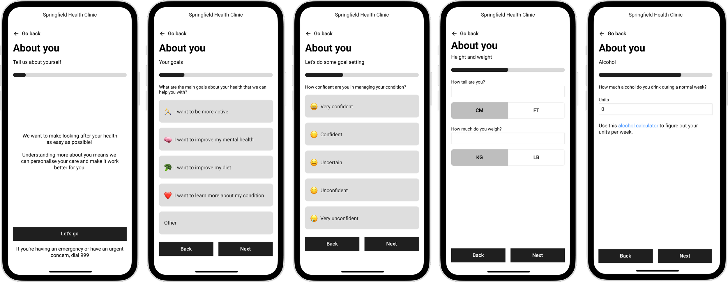
Exploration and final wireframes
Designing the content experience
Plain language, clinical accuracy
All the content was written to a reading age of 11. Suvera's patient base was diverse, and the stakes of misunderstanding were higher than in most digital products. I ran pair-writing sessions with the Clinical Lead to strip back medical language without compromising clinical accuracy, a balance that required real collaboration rather than one team handing off to another.
Reducing friction at every step
Testing showed that multiple questions per page increased errors and drop-offs. I moved to a single question per page, which reduced mistakes, improved accessibility, and improved completion rates. Every multiple-choice set was kept lean to reduce decision fatigue, and instructions were written clearly enough that patients could answer without second-guessing themselves.
Building trust through content
Some questions addressed sensitive topics. I used warm, non-judgmental language throughout. This wasn’t to soften the clinical intent, but to make sure patients felt safe answering honestly. We introduced expandable reassurance content that validated responses and explained how Suvera would use the information. I also worked with the product engineer to personalise content using existing patient data, replacing generic phrasing with something that felt individual. We reminded patients at key moments that real clinicians would review their answers, with clear next steps.
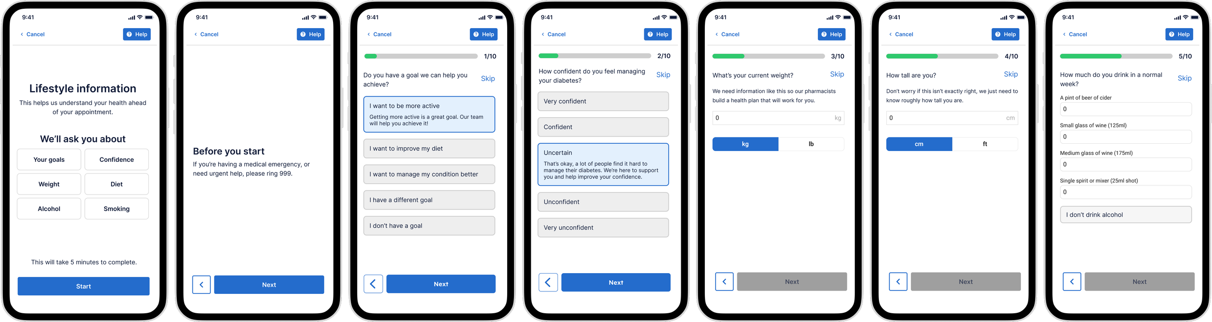
Final designs
Outcomes
85% completion rate, with just over 50% of patients responding.
Admin time reduced by around 10 minutes per appointment on average.
Pharmacists were able to see five more patients per day.
3 in 10 appointments are now conducted fully digitally.
Identified friction points, including frequent skips on height and weight, to inform the next iteration.
Learnings
Clinical accuracy and plain language aren't opposites
The pair-writing sessions with the Clinical Lead were one of the most valuable parts of this project. There’s often an assumption that clinical precision and accessible language don’t go together. In practice, simplifying language often makes the clinical intent clearer, not murkier. It's a way of working I'd build in from day one on any future project in a regulated or clinical context.
Trust is a content problem
The reassurance mechanisms, such as expandable content, personalisation, and reminders that responses would be reviewed by a real person, had a measurable effect on completion rates. Patients weren't dropping off because the questions were too hard; they were dropping off because they weren't sure their answers were safe. In healthcare, designing for trust isn't a nice-to-have.
Content-first is faster, not slower
Taking a content-first approach to wireframing often makes things much easier. The questionnaire structure was content-driven, so getting the content right early meant fewer structural changes later. The design followed the content logic rather than the other way around.
The next iteration needs logic
The absence of conditional logic limited what we could ask and collect. Questions had to apply to every patient, regardless of their condition or profile, which meant leaving out useful data points. Adding question logic would significantly improve the quality of data we could collect.