Improving Fitness to Practice
Making complex legal content not just accurate but actually useful.
My role
I led the content and UX strand of a task force to address the NMC's Fitness to Practice backlog, which had grown significantly during the COVID-19 pandemic. I was responsible for the end-to-end content strategy, cross-functional workshop facilitation, and the redesign of a section of the website that hadn't been updated in over five years.
Discovery and direction
The Nursing and Midwifery Council's Fitness to Practice directorate is the legal body responsible for handling public complaints about nurses and midwives that could end a healthcare professional's career. The content was legally accurate but quite unusable. It was jargon-heavy, hard to navigate, and written well above the average reading age.
People couldn't understand what to expect, couldn't complete the referral form without errors, and didn't trust that the process would work. That mistrust had a direct impact on the quality of submissions the NMC received, and on the confidence of nurses and midwives going through proceedings.
The teams at the NMC were heavily siloed, with each part of the directorate focused on its own piece of the process. Before designing anything, I needed to get those teams in a room together. I led four discovery workshops with stakeholders across the directorate, deliberately mixing people who rarely worked together.
These sessions surfaced insights a content audit alone couldn't have found: the specific moments when people got lost, the questions they kept calling in to ask, and the language that consistently confused them. I backed this up with a content audit, web analytics, customer service data, audience surveys, and research from forums where healthcare professionals talked openly about their experiences.
The picture was consistent across every source: content inaccessible to much of the public, legal jargon creating confusion and distrust, a referral form with significant barriers, and no clear explanation of what happened at each stage of the process and most users had no way of knowing where they were or what would come next.
Designing the content experience
Rewriting for the people who needed it most
The most foundational change was a comprehensive rewrite into plain English. I worked closely with subject-matter experts to make sure every piece of content was legally accurate and genuinely understandable. Where technical language was unavoidable, I created a glossary that explained all legal terminology.
I replaced institutional language with the words our audiences actually used, such as nurses and midwives instead of registrants, and complaint rather than referral. Every page was restructured with clear headings, short paragraphs, and a consistent reading age target throughout.
Making the process visible
Nobody could see where they were in the legal process. I worked with the website engineer to design a new step-by-step template that mapped the full journey from initial complaint through to court proceedings, with each stage clearly labelled. This became the backbone of the redesign. For the first time, users could orient themselves within the process rather than piecing it together from separate pages.
I also introduced six short videos, each featuring a real member of NMC staff explaining their team's role and when users would encounter them. Fitness to Practice proceedings carry real emotional weight, and reading dense legal content when you're frightened is exhausting. Putting real people behind a process that had previously felt faceless made a measurable difference. Qualitative feedback later showed it was the change users remembered most.
Redesigning the referral form
The referral form was a major source of poor-quality submissions. Users were abandoning it midway or submitting incomplete referrals because the form was too long, confusing, and difficult to complete properly.
I redesigned it with targeted changes like,
A new save-and-return function that allowed users to complete it across multiple sessions.
Improved error states with specific and actionable guidance.
Removed the optional questions. If a question wasn't needed to act on a complaint, it shouldn’t be included in the initial form.
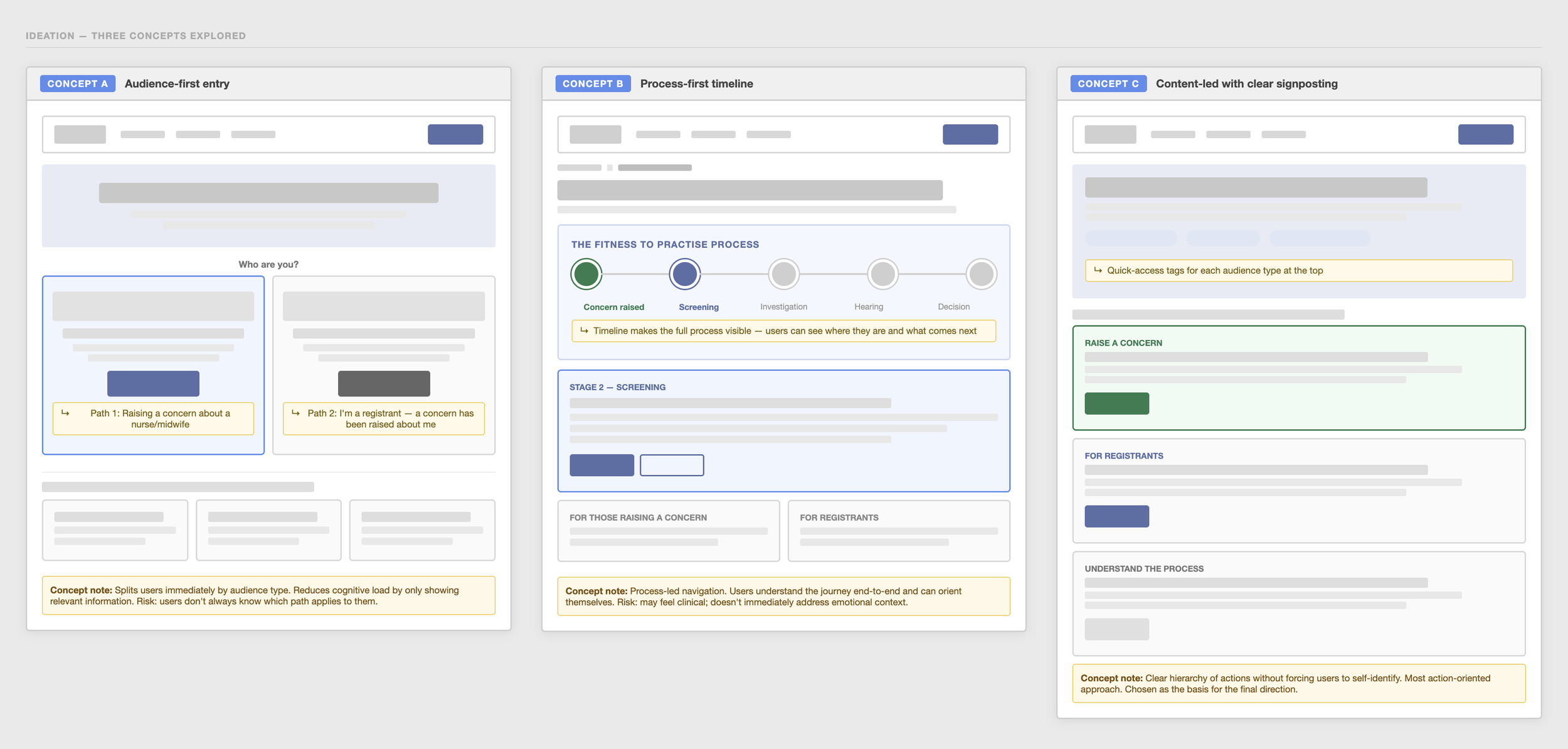
Form and page layout exploration
Outcomes
Complaint quality improved by 32%, enabling caseworkers to open and close cases significantly faster.
Bounce rate on Fitness to Practice pages decreased by 18%
Average time on page increased by 2 minutes, suggesting users were finding and engaging with content rather than leaving immediately.
Qualitative feedback showed nurses and midwives felt more supported and could find answers independently, reducing pressure on the NMC's support teams.
Learnings
Introduce agile and ways of working
Bringing agile ways of working into a team that had previously operated in a waterfall environment took more adjustment than I anticipated. A brief introduction at the start would have helped everyone earlier. It's something I'd build into the kick-off on any project moving into a new working environment.
Map dependencies before work begins
Working within a larger improvement programme meant limited visibility of what was happening in other workstreams. Dependencies became apparent once the work was already underway, making scope and capacity genuinely difficult to manage. I'd push for regular whole-programme reviews from the start, not just for awareness but because the workstreams were more interconnected than anyone had realised.
Presence builds trust
The videos had the most memorable impact. Not because they delivered new information, but because they made the process feel human. In a context as emotionally charged as a legal complaint or professional proceedings, people need to feel that real humans were on the other side. It's a signal I'd look for in any stressful content experience: where is the human moment, and is the content doing enough to surface it?