Trust from the first touchpoint
Creating a digital onboarding experience for patients who'd never chosen to be there.
My role
As Suvera's lead content designer, I owned the full onboarding experience end to end, from auditing what we were actually sending to patients to redesigning every touchpoint.
Discovery and direction
Suvera's onboarding ran entirely through text messages. Patients were introduced to the service and sent a link to the patient app. This was often without context, reassurance, or an easy way to find out more before being asked to log in to an account they'd never created.
As the patient base grew, onboarding became a much bigger problem. Patients were mistaking messages for scams, losing trust in the service, and, in some cases, asking to be discharged entirely, which had real consequences for Suvera's reputation and retention.
One of my first priorities was to audit the full onboarding experience. When I started, no one knew exactly how many messages we were sending, what triggered them, and what they said. I worked with our engineering lead to build a comprehensive service map, giving us a clear picture of the full automation and its content for the first time.
It surfaced three core problems: inconsistent tone of voice, a reading age well above the national average, and far too many messages overall. This gave us a clear foundation to work from.
Designing the content experience
Consolidating and rebuilding the messages
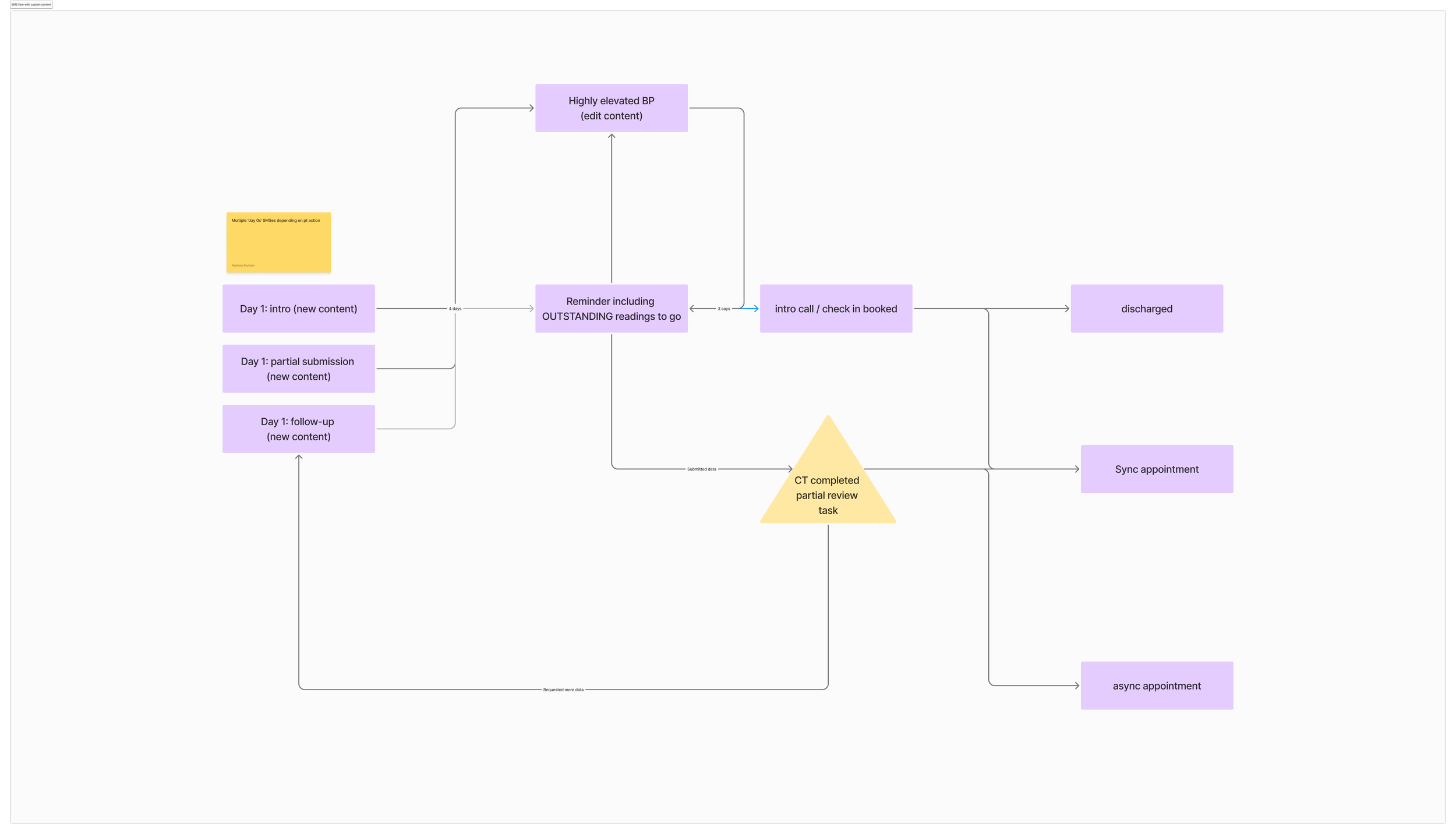
New text message automation flow
Consolidating and rebuilding the messages
I reduced the full onboarding sequence to two messages. The originals were generic, included Google tracking links that people thought were scams, and directed patients to support content hidden behind a login screen.
The revised messages introduced Suvera clearly, we personalised content using patient data, brought the reading age down to 11, and linked directly to the public website so patients could find out more before using the app.
Working with the Senior Product Engineer, I restructured the automation and increased the time between messages. This reduced complaints about feeling overwhelmed, eased pressure to complete tasks quickly, and cut the overall onboarding cost per patient.
Redesigning the login screen
The original login screen was a bare white page with our logo, which did nothing to address patients' mistrust. Working with the product designer, we redesigned it as a three-screen carousel that introduces the service, adds context, and links to the website for patients who want more information about Suvera.
Rethinking the language was important here, asking patients to "log in" when they'd never created an account created immediate unease. I looked at familiar verification patterns and replaced them with a simple, low-friction CTA like Let's start. We also added the NHS’s "providing services" logo on the first screen, giving patients a trust signal before they were asked to do anything.
Introducing a letter
Discovery research made clear that some patients needed a more traditional introduction. Many GP practices still use letters to communicate significant changes to patient care, so we introduced a letter to be sent five days before the first text, for practices to use if they wanted to.
The letter introduced Suvera, explained what to expect from the first appointment, and gave more details on using the app. For patients less comfortable with digital services, the familiar format made the transition feel considered rather than abrupt. It was a simple intervention, but the research made it clear it was necessary.
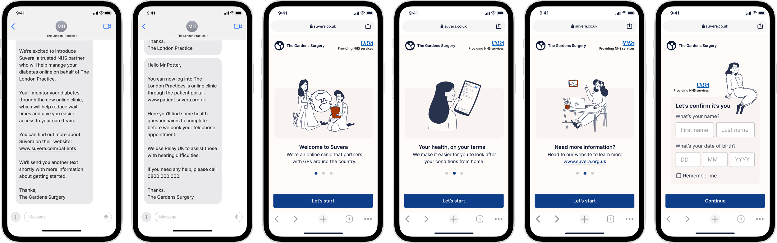
The new onboarding journey for patients using Suvera
Outcomes
Text message engagement increased by 35%
Sign-in rate from text messages increased by 20%
Complaints relating to text messages decreased by 68%
Learnings
Content can only do so much
Text messages are effective, but the rise of convincing scams has made patients genuinely and reasonably wary of texts from unknown senders, particularly those with links in them. That's not a problem content alone can solve, no matter how clear or trustworthy the writing. This project pushed me to think more broadly about where Suvera communicated, and directly shaped my later work exploring the NHS app, WhatsApp, and push notifications as more trusted alternatives.
Audit first, design second
The service map was foundational. Before building it, no one in the business had a complete picture of what patients were actually receiving. The problems it surfaced weren't visible until someone looked at the whole thing as an end-to-end journey. Making that audit a first priority rather than a background task changed what was possible on the project.
The channel is part of the message
The letter worked because the format was familiar, not because it had better information. For patients who didn't trust digital communication, the medium itself carried the trust signal. That principle was one I applied across the whole project; every channel decision was also a trust decision, and the two couldn't be separated.