Trust, from the first touchpoint
Creating a digital onboarding experience for patients who'd never chosen to be there.
Scope
Suvera's onboarding experience was built exclusively around text messages. Patients are introduced to the service, the idea of digital healthcare, and are sent a link to the patient app.
As Suvera's patient base grew, the time available to manually engage patients shrank. Onboarding had quietly become one of the most important parts of the experience, but also one of the most neglected.
Patients often mistook messages for scams, lost trust in the service, and, in some cases, asked to be discharged entirely, which had real consequences for Suvera's reputation and revenue.
For some, particularly older or less digitally confident ones, a text message from an unknown sender would never feel trustworthy, regardless of the content. So our goal was to design a clear, simple first-mile experience that answered the three questions most new patients had:
Why have I been invited?
How can Suvera help me?
What do I need to do next?
As Suvera's lead content designer, I took ownership of the full onboarding experience, from auditing what we were actually sending to patients to redesigning every touchpoint from the first text message to the login screen.
Process
One of my first priorities at Suvera was to audit the full onboarding experience. The unknowns and knowledge gaps were significant, including how many messages we were actually sending, what triggered them, and what they said to patients.
I worked with the product manager and engineering lead to build a comprehensive service map, giving us a clear picture of the full automation and its content for the first time.
The service map surfaced three core problems:
Inconsistent tone of voice across messages, creating confusion and a fragmented brand experience.
A reading age well above the UK’s national average reading age, making content inaccessible for many patients.
Patients were receiving far too many messages overall.
Refining and testing content
With a clear picture of the problems, I developed new content and validated it through moderated and unmoderated testing as well as A/B tests with real patients. Testing consistently showed the importance of:
Accessibility: Many of Suvera's partners served areas with high levels of deprivation, so reducing barriers was essential. Bringing the reading age down to around 11 years old drastically improved comprehension.
Personalisation: The original messages were largely generic ones. In testing, being able to personalise them by mentioning the patient’s condition and their specific next steps improved conversion and made the experience feel less like a mass mailout.
Finding more information: The original messages included a few support links that were hidden behind a login screen, which frustrated patients and drove them to call our support team. In testing, patients were redirected to our public website, dedicated to patients and designed to allow them to self-serve, helping reduce this frustration.
Solution
To design the final onboarding flow, I concentrated on three key areas:
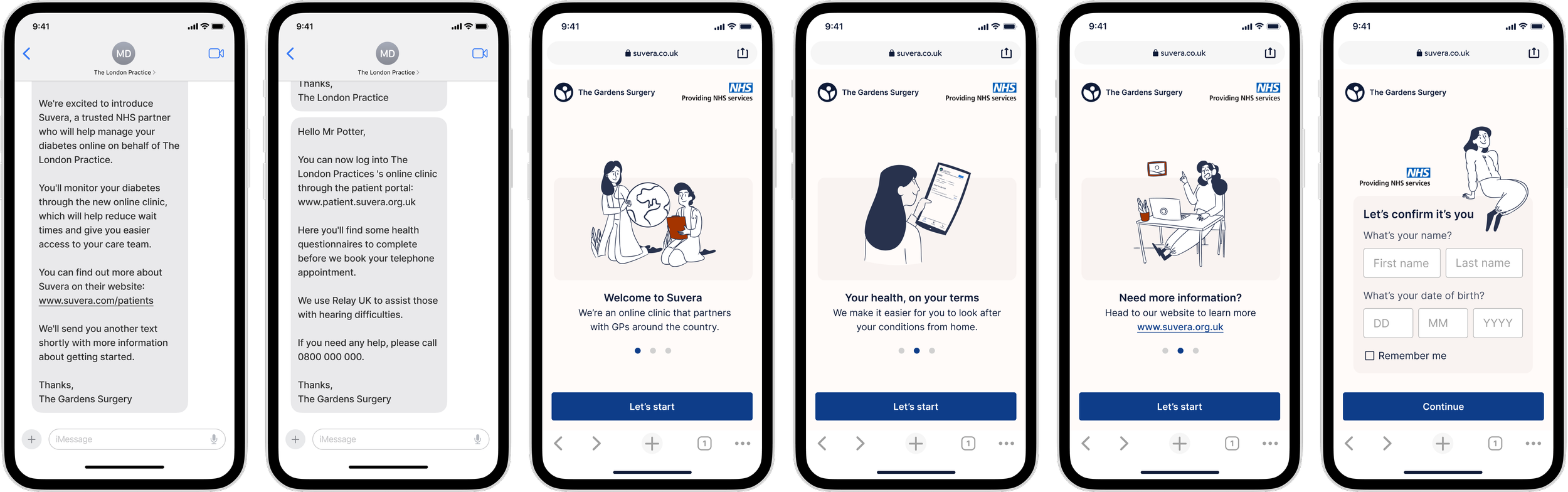
Login screen
The original login screen, a bare white page with Suvera’s logo, did little to ease patients' mistrust.
Working with our product designer, we redesigned the login into a three-screen carousel that introduces the service, adds important context, and links to the website for patients who want more information immediately.
I softened the language around logging into the app. Users felt uneasy being asked to "log in" without having ever created an account. I borrowed familiar phrasing from other identity verification flows using simple, low-friction CTAs like "Let's start”. I also added the "providing services for the NHS" logo onto the screen, giving patients an immediate trust signal.
Text messages
I consolidated the onboarding messages into two to create a much less invasive experience.
Based on testing, I revised messages in a few different ways, including:
Reduced the reading age to 11
Introduced Suvera and the service more clearly
Improved personalisation based on patient data
Removed tracking links that read as scam-like
Included a link to the website for patients who wanted more details before downloading the app.
Automation and triggers
Working with the Senior Product Engineer, we restructured the automation for all our onboarding texts, consolidating messages and increasing the time between them.
This directly reduced complaints about patients feeling overwhelmed, eased the pressure to complete tasks quickly, and cut the overall onboarding cost per patient.
Letters
Discovery research made it clear that some patients needed a more traditional introduction. Many GP practices still use letters to communicate significant changes to their services, so we introduced a letter that was sent five days before the first SMS. This letter was written on each practice's own letterhead, from their individual addresses.
The letter introduced Suvera, explained what to expect from the first telephone appointment, and gave more details on using the app. For patients less comfortable with digital services, this familiar format built trust and made the transition feel far less abrupt.
Outcomes
This project delivered strong results, significantly improving Suvera’s initial touchpoints with patients. Overall, this new onboarding experience had the following impact:
Increased overall text message engagement by 35%
Increased sign-in rate from text messages by 20%
Decreased complaints relating to text messages by 68%
Learnings
My main learning from this project was that text messages are effective. Still, the rise of convincing scams has made patients genuinely and reasonably wary of texts from unknown senders or those with links, and that's not a problem content alone can solve.
This project pushed us to think more broadly about patient comms, and directly shaped my later work exploring the NHS app, WhatsApp, and push notifications as more trusted alternatives. A thread I continued to pull across subsequent projects.