Expanding patient experience
Creating new functionality inside Suvera's patient app and improving the efficiency of care.
Scope
As a tech start-up in the healthcare sector, Suvera’s main aim was to drive effective, efficient care by creating a service that, as much as possible, was delivered through their digital patient platform.
As we expanded the types of patients we looked after, capturing patient data digitally became even more important.
The challenge? Building super flexible questionnaires that could capture a wide range of data points. That way, we could:
Cut down on the calls just to gather patient data.
Empower our care teams to provide more async support.
Give patients a top-notch experience from start to finish.
As the lead content designer, I shaped the strategy for this project, facilitated the cross-functional process, and owned the end-to-end content experience.
Process
I brought together the whole squad (product, design, and our clinical team) for a structured workshop, which was broken down into three main areas:
The problem: Balancing user needs (engagement, usability) with business goals (efficiency, scalability). Analysed patient data and insights to understand the challenges.
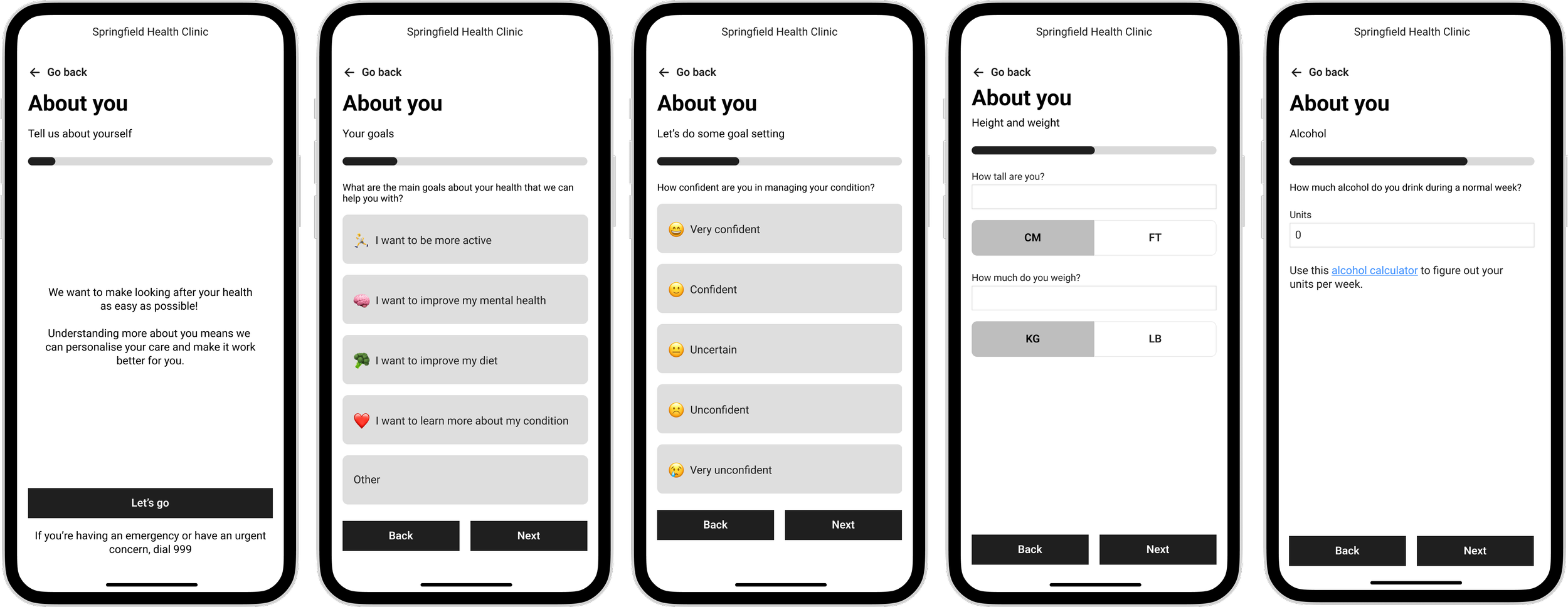
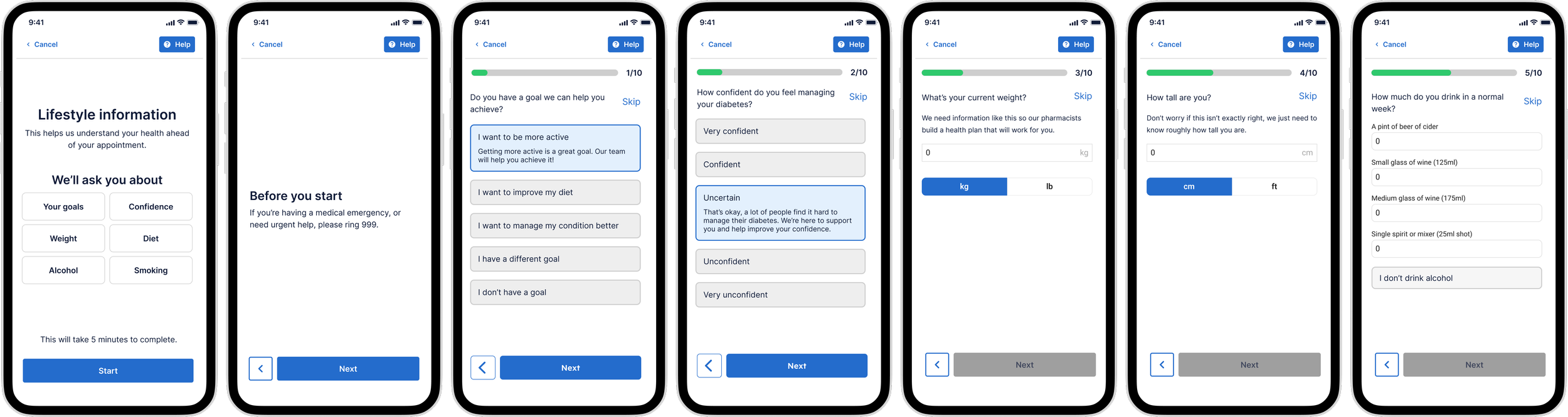
Content: Defined the key questions that support async care and save time in appointments. Mapped out the ideal question flow and topics that many patients didn’t like discussing.
UX: Explored features for smooth interaction and evaluated visual design concepts to boost engagement.
Then it was time for wireframing and testing!
I took a content-first approach, working closely with our product designer to nail down simplicity, usability, and accessibility. We wanted a super clear, compassionate patient experience that minimised cognitive load as much as possible. User testing and design reviews helped us refine these wireframes.
When it came to the final designs, I focused on principles such as clear language, a compassionate and approachable tone and strategic question structuring to create the best possible questionnaire flow.
The result was an intuitive, engaging experience that empowered patients and streamlined care.
Solution
I collaborated closely with our product designer to make sure every element helped users move through the questionnaire smoothly and with as little friction as possible.
Key content principles
Simple and accessible: Suvera's user base was diverse, so all content was written to a reading age of 11. I ran pair-writing sessions with the Clinical Lead to simplify medical language without compromising on clinical accuracy.
Compassionate and empathetic: Some questions addressed sensitive topics, such as alcohol consumption. I used warm, non-judgmental language so patients felt respected and safe, not scrutinised.
Clear and concise: Every word earned its place. Content was crafted to enable users to scan, understand, and act.
Reducing cognitive load
One question per page: Testing showed that multiple questions per page increased errors and drop-offs. A single question per page reduced mistakes, improved accessibility, and boosted our completion rates.
Clear instructions: Straightforward guidance at each step meant users could answer confidently, without second-guessing.
Fewer decision points: I kept multiple-choice options lean to reduce decision fatigue and maintain momentum.
Building trust
Built-in reassurance: We introduced expandable content that validates a user's response and explained how Suvera could help, so no one felt like they had answered "wrong."
Personalised content: Working with the product engineer, we used existing patient data to personalise content, replacing generic phrases with something that felt made for that individual.
Introducing the care team: Reminding users that real people would review their data, with clear next steps, gave patients confidence in the process.
Outcomes
This project delivered strong results, significantly improving Suvera’s ability to collect patient data and carry out care digitally.
By focusing on clear content and well-structured questionnaires, we achieved a completion rate of 85%, with just over 50% of patients responding.
This meant we had significantly enhanced Suvera’s ability to provide async care because:
Admin time was reduced by about 10 minutes per appointment on average.
Pharmacists could now see five more patients per day because of the time saved.
With increased data, 3 out of 10 appointments could now be done digitally.
We also gathered valuable insights, like frequently skipped questions (height and weight) and homepage drop-off rates, to refine future iterations.
Learnings
With more time, I would have focused on enhancing the homepage and adding logic to the questionnaires. The absence of logic limited the types of questions we could include, preventing us from collecting more valuable data.
Despite this, the project is a strong example of how accessible design, thoughtful processes, and well-crafted content can improve the user experience.